Performance
Last updated: 2026-03-10
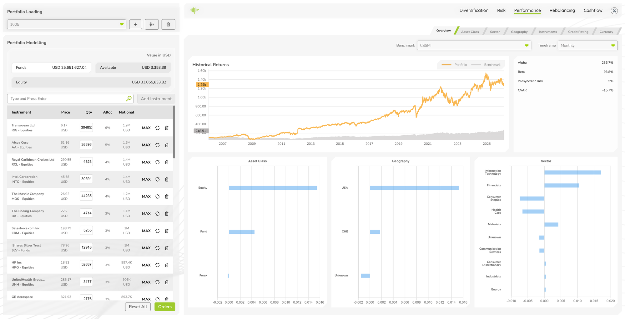
The Performance tab gives advisers and portfolio managers the language to explain investment decisions in quantitative terms. When a client asks why the portfolio outperformed last quarter, the Attribution sub-tabs can show exactly which asset class allocation decisions and which individual instrument picks were responsible. It provides historical return analysis and Brinson-Fachler attribution across multiple dimensions — answering both "how did the portfolio perform?" and "why did it perform that way?" relative to a benchmark.
Benchmark and Timeframe Selectors
Two dropdowns at the top of the tab control what is displayed across all sub-tabs:
- Benchmark — select any index (e.g. S&P 500, MSCI World) to use as the performance reference
- Timeframe — choose the analysis period: Monthly, Quarterly, Yearly, or a custom date range
Overview Sub-Tab
The Overview sub-tab contains three sections:
Historical Returns Chart
A line chart showing portfolio return (orange line) versus benchmark return (grey line) over the selected timeframe. The chart makes periods of outperformance and underperformance immediately visible. Hovering over any point shows the exact return figure for both series.
Asset Class, Geography, and Sector Charts
Three bar charts below the historical returns chart break down return contributions by:
- Asset Class — how each asset class (Equities, Fixed Income, Commodities, etc.) contributed to overall return
- Geography — return contribution by geographic region
- Sector — return contribution by sector (Technology, Consumer Staples, Financials, etc.)
These charts provide a quick visual summary of which parts of the portfolio drove performance in the selected period.
Attribution Analysis Sub-Tabs
Six sub-tabs provide detailed performance attribution analysis, each segmenting the portfolio differently:
| Sub-Tab | Segmentation |
|---|---|
| Asset Class | By broad asset category |
| Sector | By industry sector |
| Geography | By country or region |
| Instruments | By individual instrument |
| Credit Rating | By credit quality (for fixed income) |
| Currency | By currency exposure |
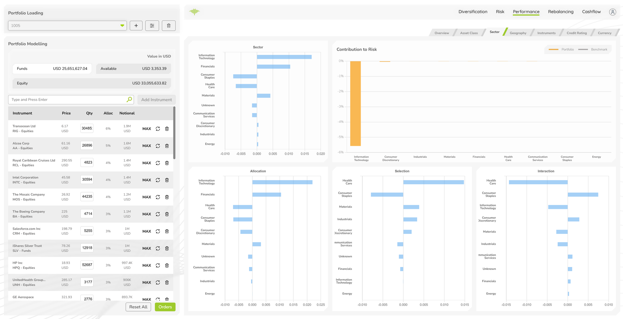
Each attribution sub-tab displays:
Total Effect Chart
A bar chart showing the total active return contribution for each segment. Positive bars indicate segments that contributed to outperformance; negative bars show segments that detracted.
Allocation / Selection / Interaction Breakdown
The total effect is decomposed into three components using the Brinson-Fachler model:
- Allocation Effect — return attributable to overweighting or underweighting segments relative to the benchmark
- Selection Effect — return attributable to instrument selection within each segment
- Interaction Effect — the combined effect of allocation and selection decisions
Contribution to Risk Chart
A bar chart showing how much of total portfolio risk each segment contributes, enabling comparison between segments that drove return and segments that drove risk.
