Risk Analysis
Last updated: 2026-03-10
The Risk Analysis tab is designed for pre-trade risk validation and client conversations about downside protection. The Stress Test shows where a proposed portfolio sits on the efficient frontier before any orders are placed, while the Hypothetical Scenarios tool lets advisers build custom shock scenarios — such as a geopolitical crisis or a sector correction — and show clients the quantified impact in advance. It provides two complementary tools: a quantitative stress test and a scenario builder for modelling custom factor-based events.
Stress Test Sub-Tab
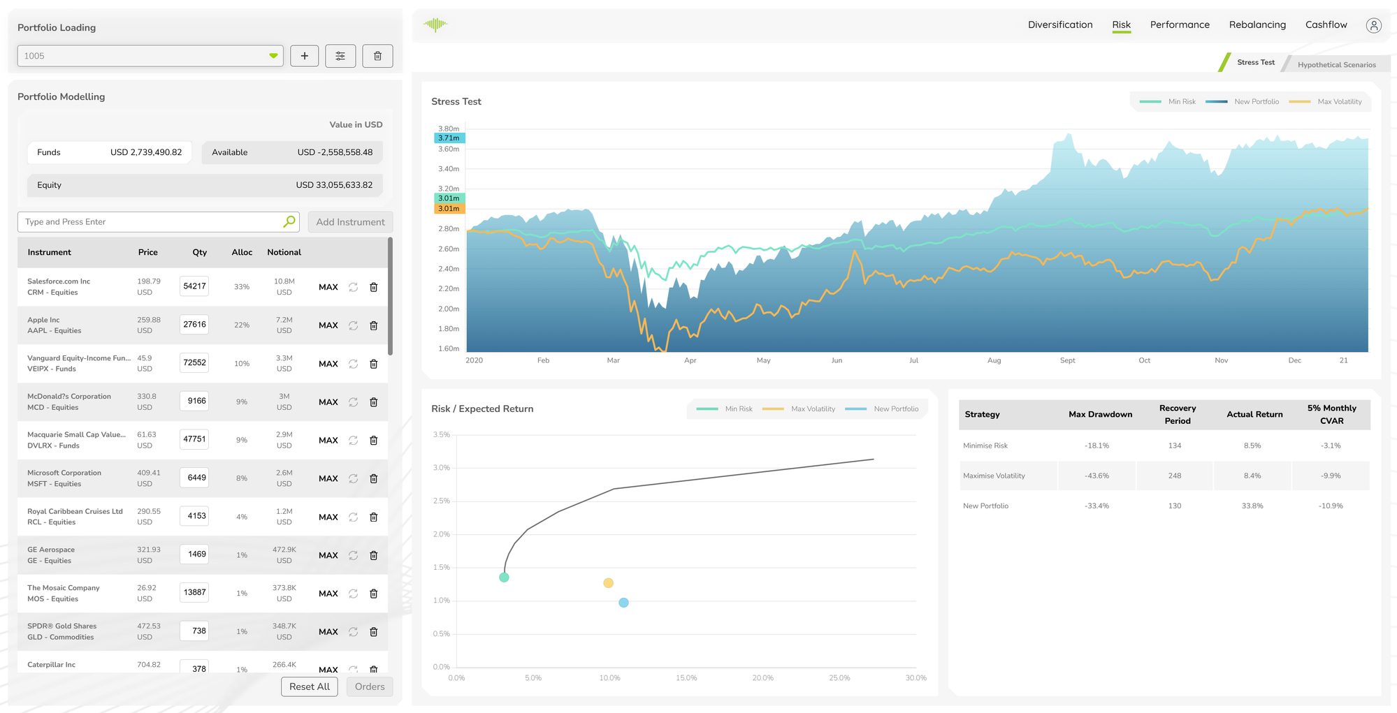
Running an Analysis
When portfolio changes have been made in the left panel, a Risk Analysis prompt appears asking you to run a new analysis. Click Run Analysis to compute updated results. The analysis runs the portfolio through the risk engine and populates all three components of the Stress Test view.
Stress Test Line Chart
A time-series chart comparing three portfolio states over the analysis period:
- Min Risk (green) — the portfolio optimised for minimum CVaR
- New Portfolio (blue) — the current modelled portfolio
- Max Volatility (orange) — the portfolio at maximum allowable volatility
Plotting all three lines together shows where the modelled portfolio sits relative to the risk boundaries over time, including how each strategy behaved during periods of market stress.
Risk / Expected Return Chart
A scatter plot of Risk vs Expected Return showing the efficient frontier curve alongside three labelled data points — Min Risk, Max Volatility, and New Portfolio. Portfolios on the frontier achieve the highest expected return for a given level of risk. The position of the New Portfolio dot relative to the curve shows whether the current allocation is efficient.
Analytics Table
A comparison table of key risk metrics across strategies:
| Column | Description |
|---|---|
| Strategy | Minimise Risk, Maximise Volatility, New Portfolio |
| Max Drawdown | Worst peak-to-trough decline over the analysis period |
| Recovery Period | Number of days to recover from the maximum drawdown |
| Actual Return | Realised return over the analysis period |
| 5% Monthly CVAR | Expected loss in the worst 5% of monthly outcomes |
Hypothetical Scenarios Sub-Tab
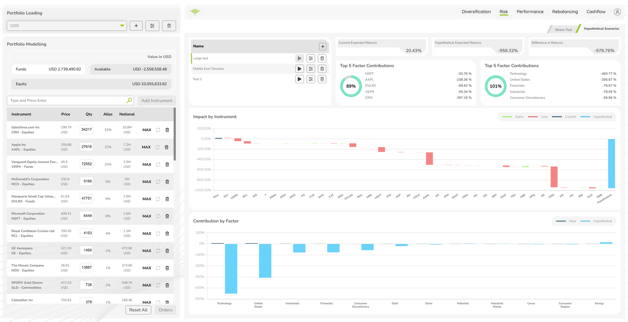
The Hypothetical Scenarios sub-tab allows users to construct custom market shock scenarios and immediately see their impact on the portfolio.
Scenario List
Saved scenarios are listed on the left with their names (e.g. "Large test", "Middle East Tensions", "Test 1"). Each scenario has run, configure, and delete controls. Click any scenario to load its results.
Stat Cards
Three headline cards at the top show the aggregate impact of the selected scenario:
- Current Expected Returns — the portfolio's expected return under normal conditions
- Hypothetical Expected Returns — the expected return if the scenario occurs
- Difference in Returns — the change between current and hypothetical
Top 5 Factor Contributions
Two donut charts display the top 5 contributing factors to the scenario impact, one for the current portfolio and one for the hypothetical portfolio. Each chart shows the percentage contribution of each factor (instruments or sectors) alongside a total impact figure.
Impact by Instrument Chart
A waterfall-style bar chart showing the return impact on each instrument under the scenario. Green bars indicate instruments that gain value; red bars indicate losses. A dark blue Current and light blue Hypothetical series are overlaid to compare the before/after position for each instrument.
Contribution by Factor Chart
A bar chart breaking down the scenario's total return impact by risk factor (e.g. Technology, United States, Industrials, Financials, Gold, Silver). The dark blue New series and light blue Hypothetical series show how factor exposures shift under the stress event.
